As a UX Lead at Creately
As UX Lead at Creately (2021-2023), I led a transformation focused on business users. We achieved a 35% ARR increase and 20% customer retention boost by prioritizing user experience. Creately's innovative solutions are showcased at www.creately.com and app.creately.com. While an NDA prevents me from disclosing specific confidential data, this case study outlines our strategic approach and the resulting business impact, showcasing how a focus on user experience can drive tangible results in the SaaS industry.
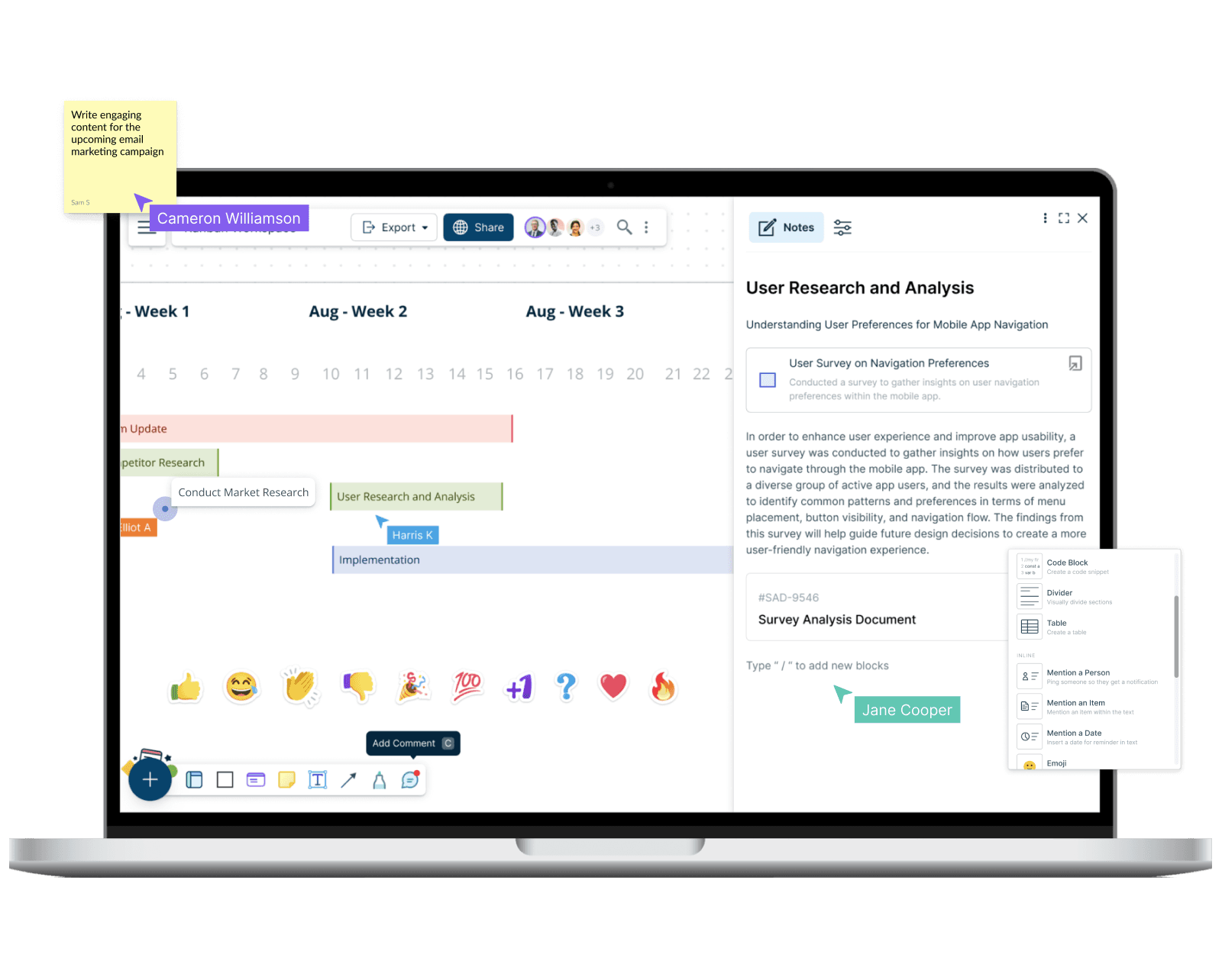
User-Centric Design and Innovation
We adopted a user-centric design approach, employing design thinking and agile methodologies to gather insights from a wide range of users, including business analysts, project managers, and enterprise teams. Through extensive research and feedback, we identified key pain points and opportunities for improvement.
AI-Powered Efficiency
We integrated AI to streamline diagram creation, offering over 1000 customizable templates and intelligent suggestions. This enabled users to generate professional-looking visuals quickly, saving valuable time and resources.
Enhanced Collaboration
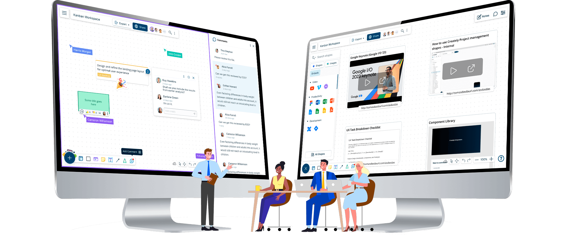
We implemented real-time collaboration features, such as simultaneous editing, commenting, and version history, to facilitate seamless teamwork and communication.
Intuitive Interface
We redesigned the interface for clarity and focus, prioritizing essential information and reducing distractions. This improved user experience, particularly for project managers and decision-makers.
Seamless Integrations
Recognizing the importance of existing workflows, we integrated Creately with popular business platforms like Microsoft Teams and enabled in-canvas embeds for a variety of tools (YouTube, Figma, Google Sheets, etc.).
Knowledge Organization and Discovery
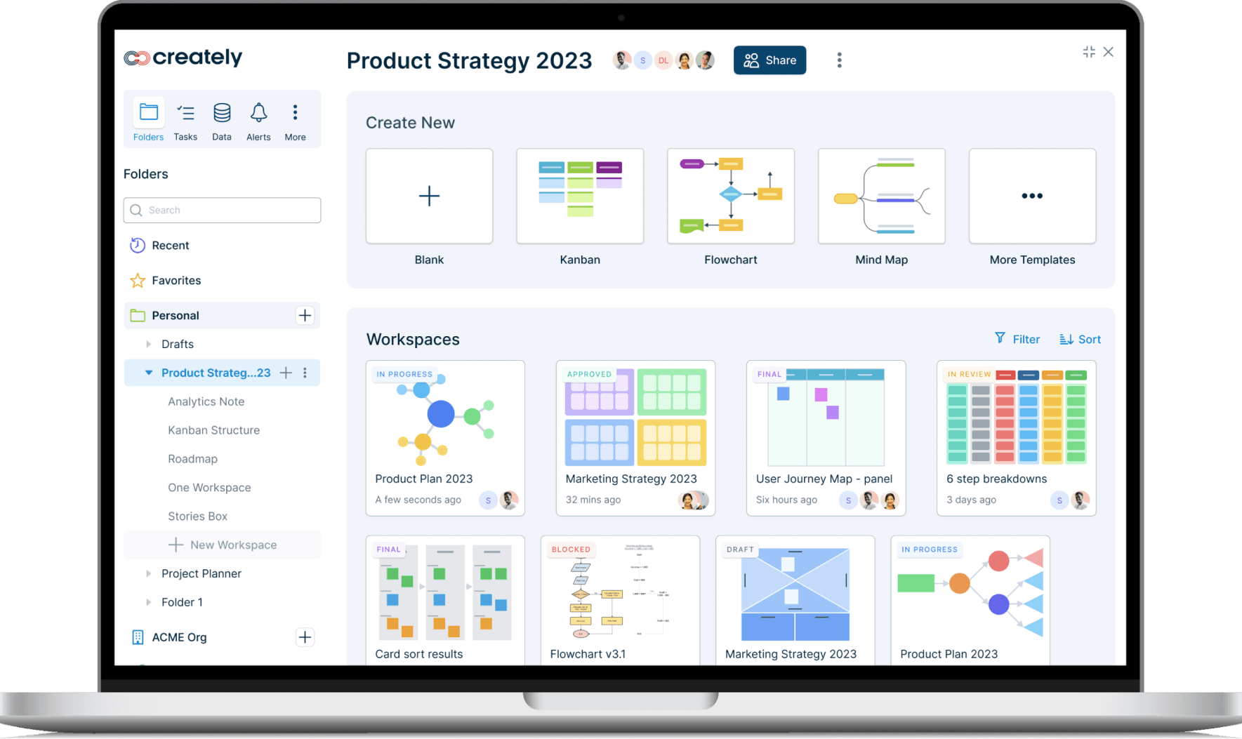
To address the challenges of managing complex projects and diverse teams, we developed robust organization features. Users can now create folders, set granular permissions to control access, and easily discover relevant content through curated lists and templates. This enhanced organization streamlines workflows, improves collaboration, and ensures that information is readily available when needed, contributing to increased efficiency and productivity for teams of all sizes.
below are some user stories from which the solution was created
- As a Team Leader, I want to organize project diagrams into folders, setting permissions for each team member based on their role.
- As a Frequent User, I want to quickly access my most used diagrams and favorites from a dedicated section on my dashboard.
- As a New User, I want to explore Creately's template library to find inspiration and quickly start creating my own diagrams.
Infinite Canvas and Comprehensive Shape Library
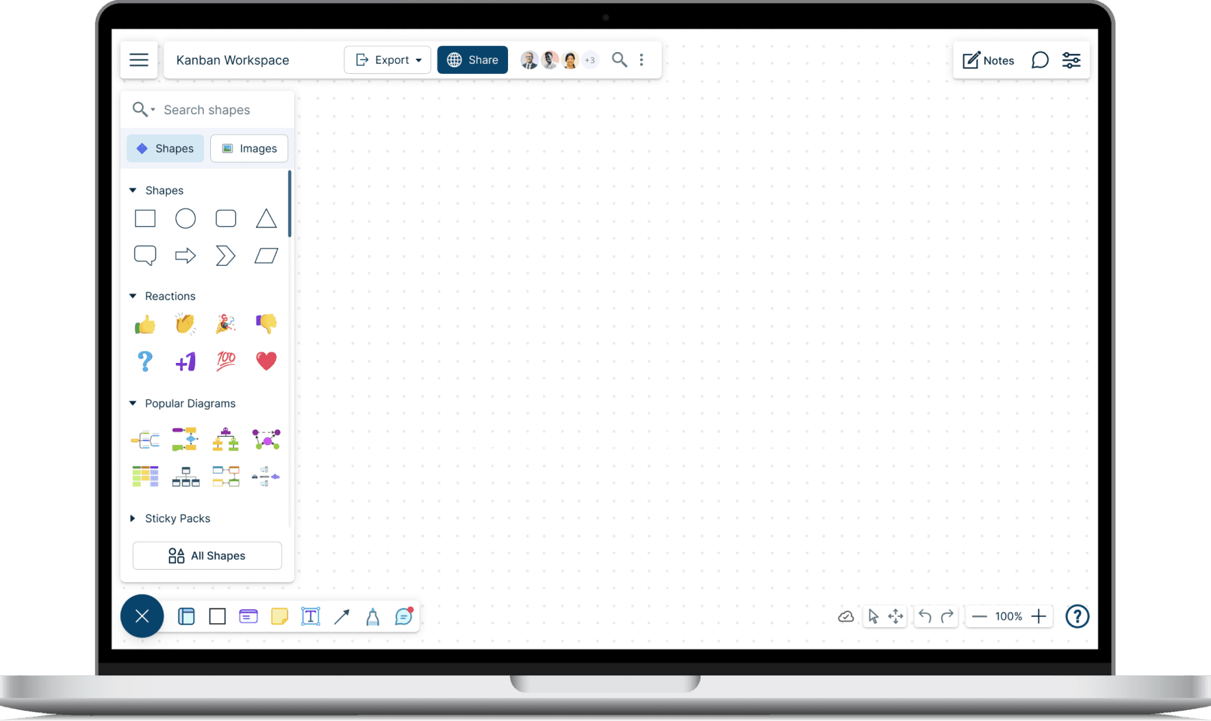
Understanding the diverse needs of visual thinkers, we empowered users with an infinite canvas and a vast library of shapes. This flexibility allows for the creation of complex diagrams, from network infrastructures to process flows. We organized the shapes intuitively, making it easy for users to find what they need.
below are some user stories from which the solution was created
- As a Systems Architect, I can easily visualize complex network infrastructures with Creately's infinite canvas and extensive shape library.
- As a Business Analyst, I can quickly and accurately create comprehensive process flow diagrams thanks to Creately's vast, categorized shape collection.
- As an Educator, I design large, detailed diagrams on Creately's infinite canvas, using diverse shapes to make complex concepts easier for my students to understand.
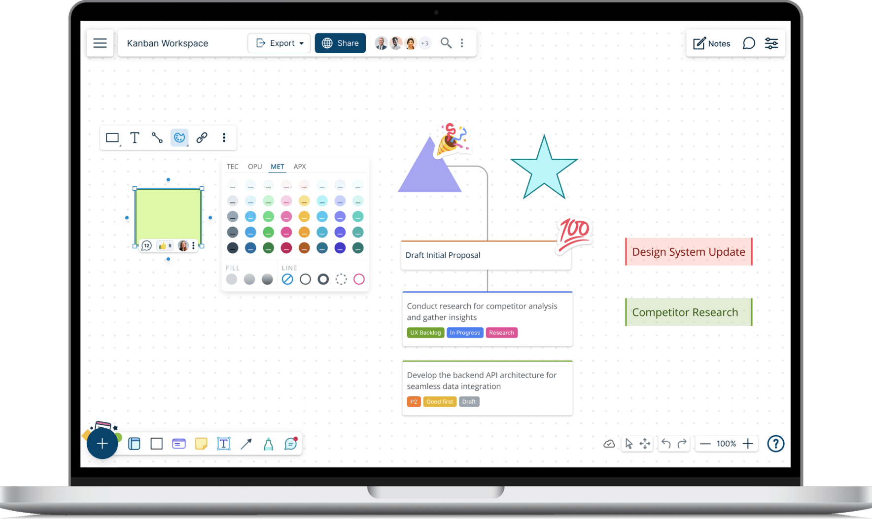
Customization and Collaborative Feedback
We recognized the need for personalization and streamlined communication within teams. To address this, we introduced robust customization features and collaboration tools
below are some user stories from which the solution was created
- As a Team Lead, I can assign ownership to shapes and use comments and likes to gather feedback from my team, streamlining our design review process.
- As a Marketing Manager, I can create visually engaging presentations with custom color themes and smart cards that highlight key points.
- As a Software Developer, I can use line connectors and text labels to clearly define relationships between different components in my system architecture diagram.
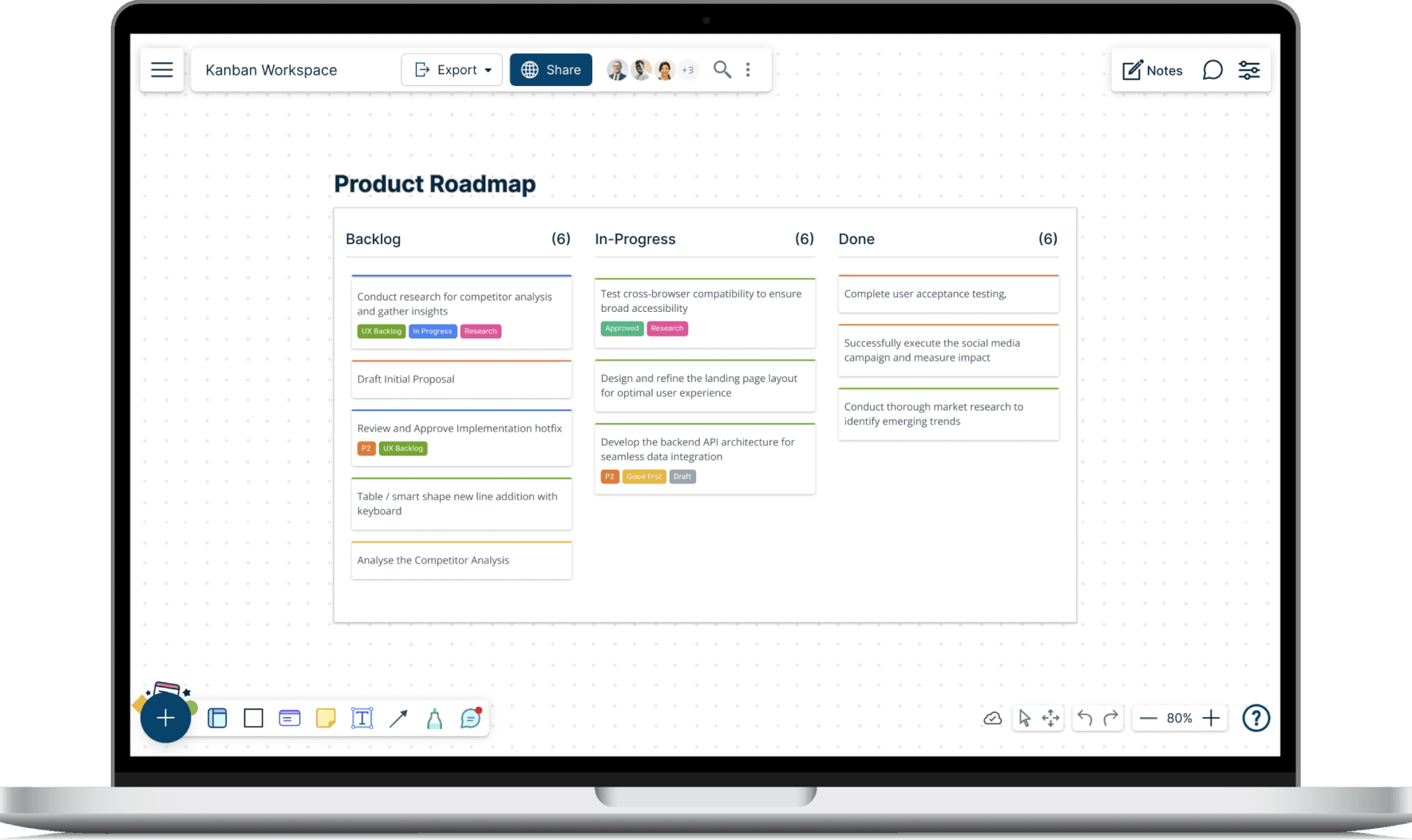
Visual Workflow Management
Understanding the critical role of project management, we transformed Creately diagrams into interactive Kanban boards. This allowed teams to track tasks visually, manage workflows efficiently, and collaborate seamlessly. This improves transparency, communication, and enables teams to stay on track and deliver projects successfully.
below are some user stories from which the solution was created
- As a Project Manager, I can create a Kanban board to track project progress, moving cards between To-Do, In-Progress, and Done columns.
- As a Software Engineer, I can add details to cards, including descriptions, deadlines, and assignees, so the development progress is smooth
- As a Marketing Team, we can use a Kanban board to manage our content calendar, so we can plan timely posts
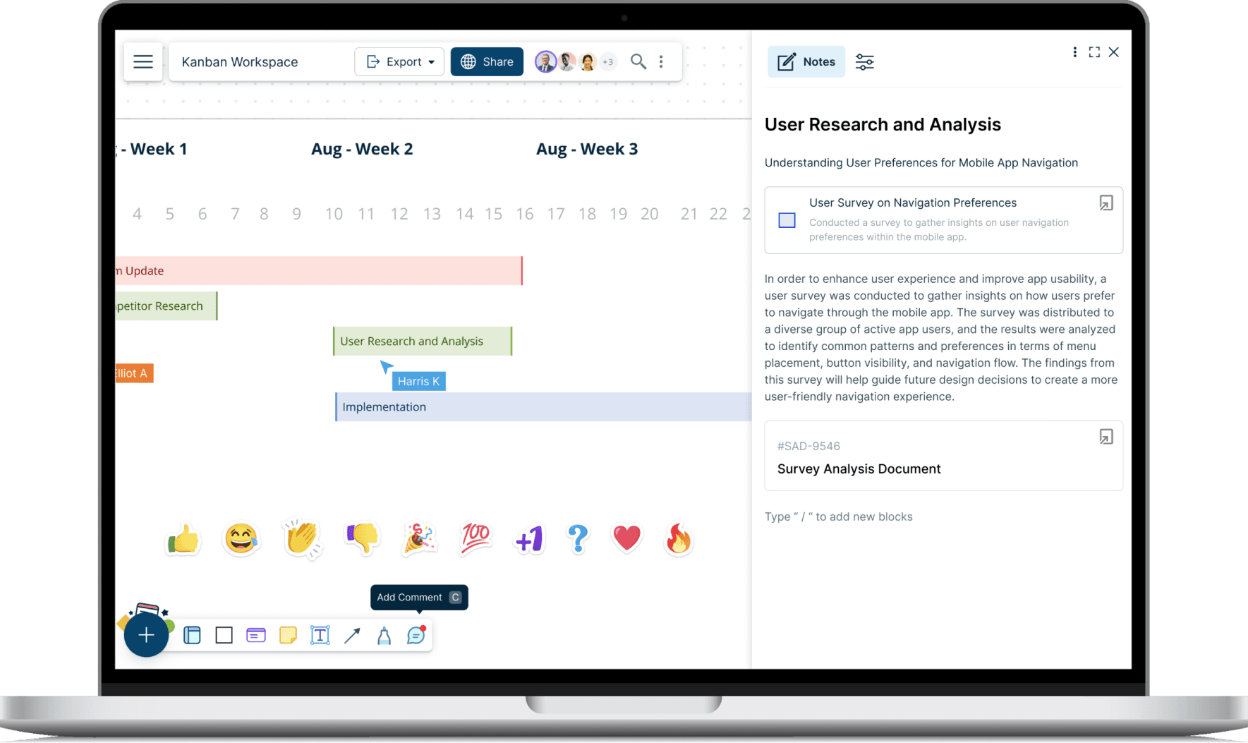
Rich Contextual Notes
We enhanced Creately's functionality by enabling users to add rich context to their diagrams through notes. Users can attach notes to any card or shape, including detailed descriptions, images, tables, assignees, and more. This feature provides a deeper understanding of the elements within the diagram and facilitates better communication and decision-making.
below are some user stories from which the solution was created
- As a Project Manager, I can add detailed task descriptions, deadlines, and assignees to Kanban cards, keeping all project information organized in one place.
- As a Designer, I can attach reference images and design inspiration to shapes in my mood boards, providing context for my creative choices.
- As a Researcher, I can use notes to document additional data and findings, ensuring my 2x2 grid analysis is comprehensive and insightful.
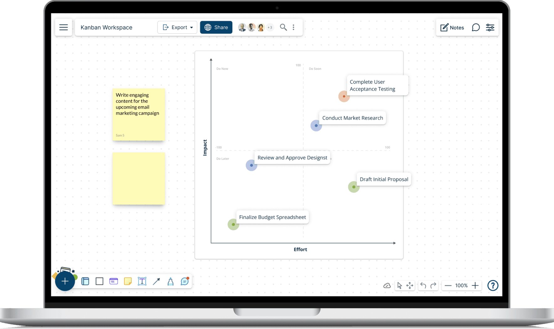
Dynamic Visual Mapping and Analysis
We recognized the value of transforming diagrams into dynamic tools for analysis and decision-making. Creately now allows users to organize ideas visually, track progress, and gain valuable insights through features like custom variables, progress tracking, and data-driven insights. This dynamic visual mapping approach empowers teams to go beyond static diagrams, leveraging their visual representations to extract actionable insights and drive continuous improvement.
below are some user stories from which the solution was created
- As a Strategist, I can create a 2x2 grid to map out business strategies, categorizing ideas by impact and effort to prioritize initiatives.
- As a Product Manager, I can visualize user feedback on new features by placing cards on a grid based on user satisfaction and frequency of use.
- As a Researcher, I can analyze survey data by mapping responses onto a grid based on demographic variables, uncovering patterns and correlations.
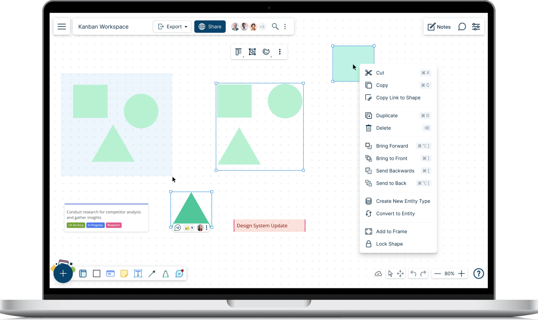
Professional Design and Looks
We integrated professional design tools to help users create polished, visually appealing diagrams. Features like shape grouping, layering control, and precise alignment tools empower users to refine their visuals, ensuring clarity and impact.
below are some user stories from which the solution was created
- As an Infographic Designer, I can easily group related shapes into frames, creating visual containers that can be moved and resized as a single unit.
- As a UI/UX Designer, I can use the z-index adjustment panel to control the layering of elements in my wireframes, ensuring the correct visual hierarchy.
- As a Data Visualizer, I can precisely align shapes and text within my diagrams using Creately's alignment tools, creating a clean and professional look.
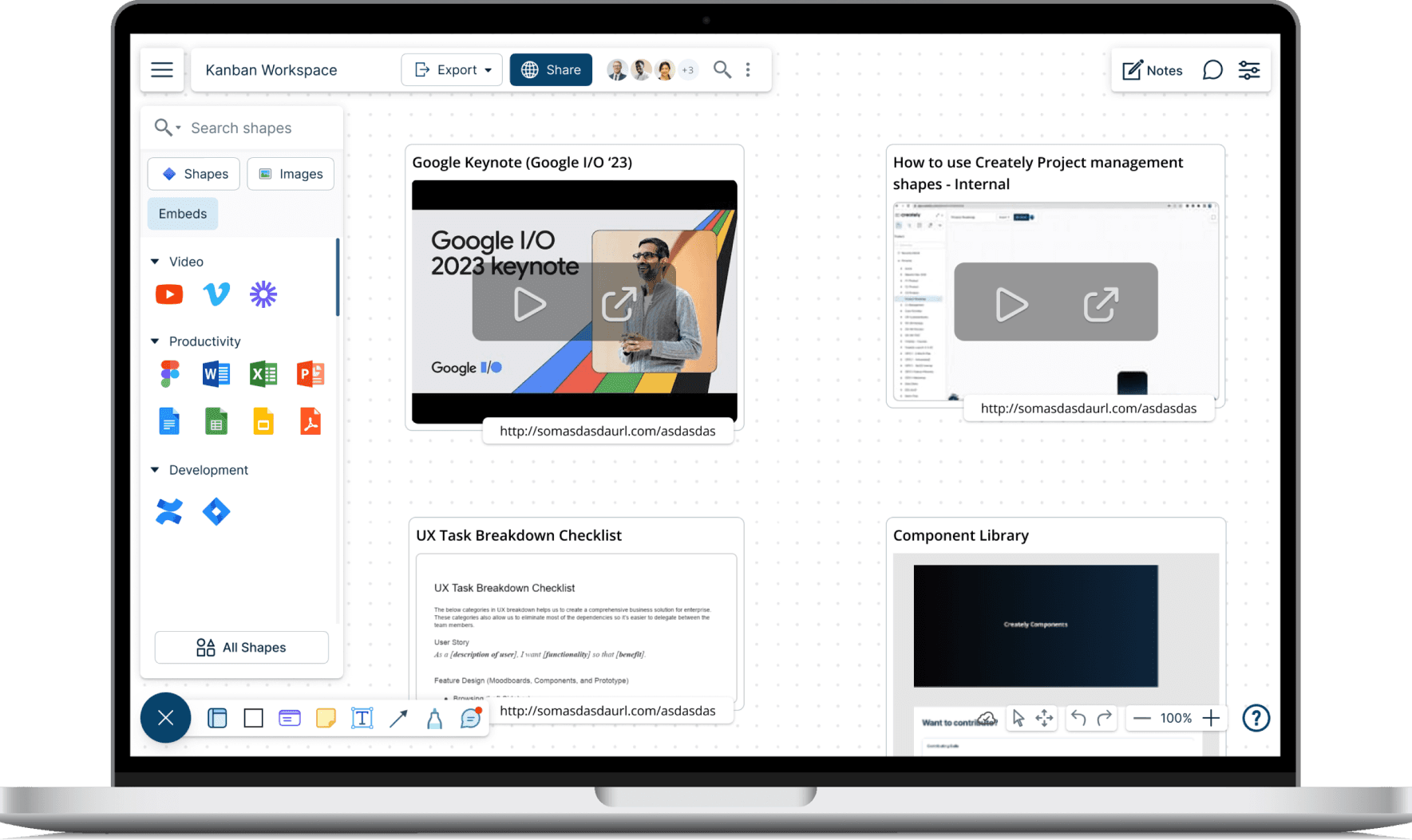
Rich Media Embeds
To enhance the information richness and interactivity of diagrams, we enabled the embedding of various media types. Users can now incorporate videos, documents, spreadsheets, and more directly into their visuals. This facilitates better storytelling, comprehensive documentation, and improved communication within teams.
below are some user stories from which the solution was created
- As a Marketer, I can embed a YouTube video explaining a product demo directly into my marketing plan diagram.
- As a Project Manager, I can embed a live Google Sheets spreadsheet showing project timelines and budgets into my project overview diagram.
- As a Researcher, I can embed a Microsoft Word document detailing research findings into my data analysis diagram for easy reference.
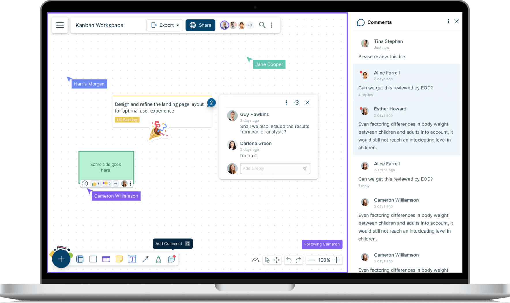
Real-time Collaboration and Feedback
Introduced seamless collaboration by enabling comments directly on diagram elements. Users can discuss specific shapes, tag colleagues for feedback, and track the resolution of comments, enhancing communication and ensuring everyone stays informed and engaged.
below are some user stories from which the solution was created
- As a Product Manager, I can leave a comment on a specific feature in a product roadmap diagram to ask my team for their input.
- As a Designer, I can tag team members in comments for immediate feedback on design choices, ensuring everyone is aligned.
- As a Stakeholder, I can follow and resolve comments to stay informed and engaged.
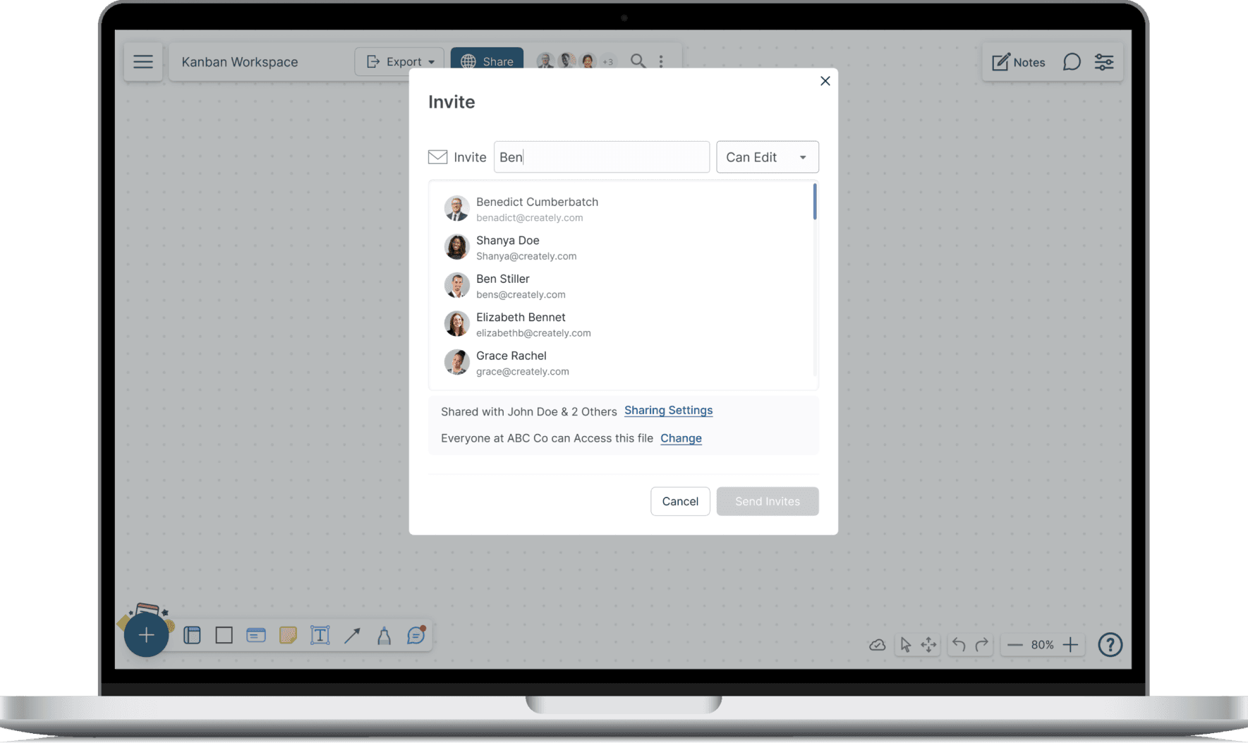
Secure Sharing and Permissions
We implemented sharing and permission controls to ensure secure collaboration. Users can now share diagrams with granular permissions, controlling who can view, comment, or edit. This allows for flexible collaboration while safeguarding sensitive information.
below are some user stories from which the solution was created
- As a Team Lead, I want to share my project diagram with the team for editing, while limiting access for external stakeholders.
- As a Consultant, I need to share a diagram with a client, allowing them to comment on specific sections for feedback while preventing any edits.
- As a Freelancer, I want to share my portfolio securely with clients using a password-protected link.
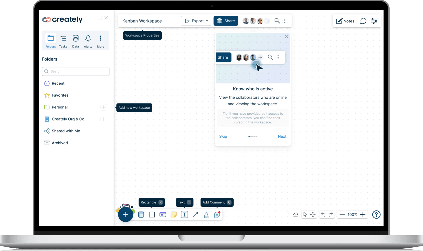
Intuitive Onboarding and Learning
We recognized the importance of a smooth onboarding experience for new users. To achieve this, we integrated interactive tutorials, contextual tooltips, and animated instructions to guide users through Creately's features. This reduced the learning curve and empowered users to quickly become proficient with the platform.
below are some user stories from which the solution was created
- As a New User, I can follow a step-by-step walkthrough to understand the core features and tools, saving me time and frustration.
- As an Occasional User, I can rely on tooltips to quickly refresh my memory on specific functions without having to search for help.
- As a Visual Learner, I can easily grasp new concepts through animated instructions, ensuring a smooth and enjoyable learning experience.
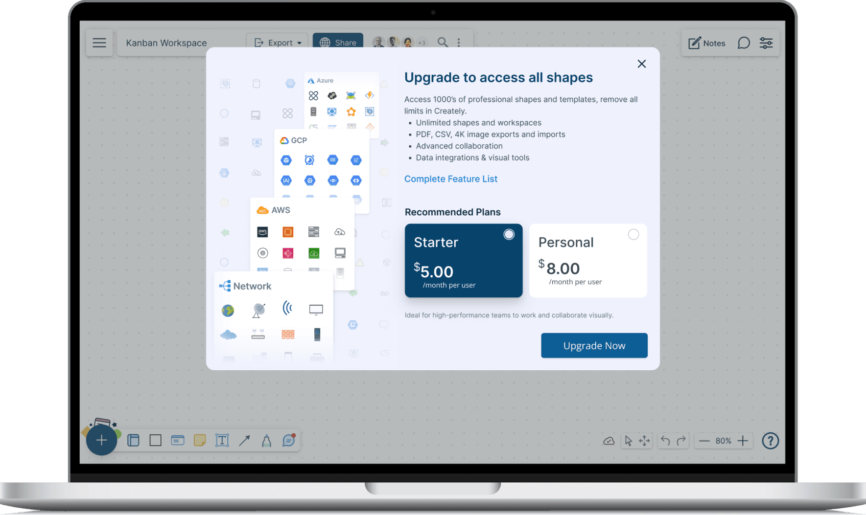
Flexible Pricing and Seamless Upgrading
We designed a flexible pricing model with various plans to cater to different user needs. Upgrading is seamless, allowing users to explore premium features and choose the plan that best suits their requirements. Our secure payment process ensures a smooth and worry-free transition for new subscribers.
below are some user stories from which the solution was created
- As a Free User, I want to explore before upgrading. The prompt appears when needed.
- As a Potential Subscriber, I want to easily compare pricing plans. The comparison screen provides a clear overview of the benefits of each plan.
- As a New Subscriber, I want a smooth and secure payment process. The payment method selection screen offers multiple options and ensures my data is protected.